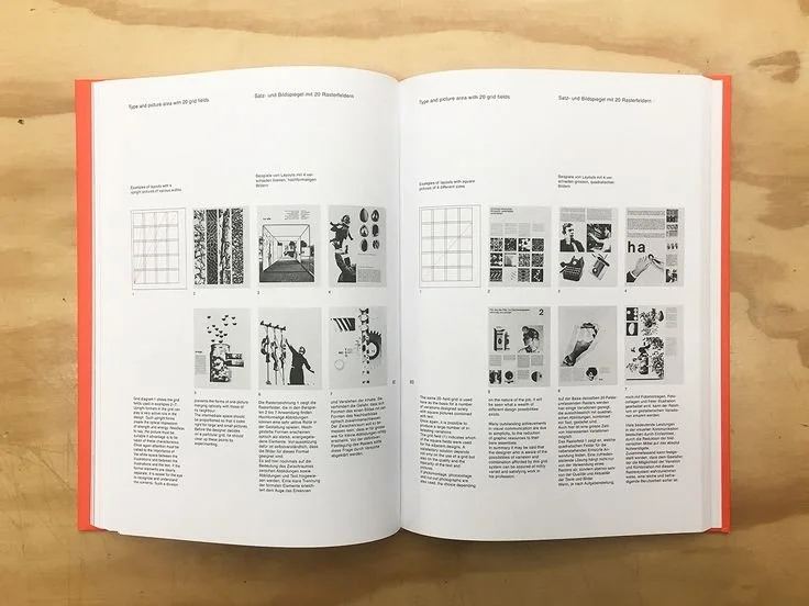
Brockmann’s Grid Systems in Graphic Design Review
One of the foundations of good graphic design is grid systems. And they are needed for good reason. Meghan Lazier writes in her “Power of the Grid” article that:
“Grids help ensure a consistent framework to organize graphic elements, like type and images, into a hierarchy”
Yet, learning how to make a proper grid is extremely hard when starting off as a designer. If you haven’t gone to a graphic-based college or program, many people who want to learn about design may not know the best way to make a grid.
So I decided to learn from an outside perspective. I wanted to find a way to learn about grid systems in a way that's accessible to everyone. That’s when I came across a lovely book called Grid Systems in Graphic Design. This book does an excellent job explaining the best ways of handling grid systems and teaches more about the organization of other elements like typography and visual appeal. So let's look at how this book does its job well.
What to Know
Grid Systems in Graphic Design was created by Josef Muller-Brockmann in 1996. The book is relatively decent in size, at 165 pages. Brockmann's book serves to inform inexperienced and beginner designers about just how many benefits can come from grid systems and their different types. Having a good grid structure results in a design having “a sense of compact planning, intelligibility, and clarity, and suggests orderliness of design”.
Main Points: Items that Impact of a Grid
Grid Systems in Graphic Design has much to offer designers and people interested in the field. To start, here are some unique things to note about what impacts a grid. He believes the most vital impacts on grids are the following.
Typographic Measuring System: Type is measured in Points or pt. The size will impact the gridding structure. For your body paragraphs, 8-12 pt is ideal. Most titles or headings can be anything from 12-60 pt.
Typeface alphabets: A typeface family can significantly impact your grid. For example, a serif typeface like Garamond is more for titles and headings, while a sans serif like Berthold can be beneficial as small and readable text.
Width of the column: The width of a column depends on the size of the text and the length of the words. The bigger the text, the wider the column. And vice versa, the smaller the text, the smaller the column can be.
Leading: Leading impacts the spacing of your words. Follow this structure for leading.
Size of Text: 7pt, have a leading of 1,2,3 or 4pt.
Size of Text: 10pt, have a leading of 1, 2, 4, 8, or 16pt.
Size of Text: 20pt, have a leading size 4, 8, 2 or 32pt
Scale Reference
Margin proportions: Margins are a key component of grids. Having margins makes the middle of a page feel bold while having 2-3 margins be the same and 1 different size results in contrast.
Page Numbers: Page numbers can go in the four corners of a page. They create a dynamic composition and make reading left to right feel quicker.
Body and Display Faces: Spacing and bolding of titles affect your paragraphs.
Main Points: Construction of a Grid
Now that we know what impacts a grid, let's discuss its construction. When you are constructing a grid, Brockmann recommends the following:
Begin practicing with 2,3 and 4-column grids. He recommends this because the larger the grids, the more completed the text will become, so starting with bigger columns helps new designers learn quickly.
Be careful with your margins. Depending on the text size you use, you should find a middle ground of depth, not too thin so that it blends, but not too wide so that it looks off.
The grid is always first. Don’t worry about images or text yet. The grid must be made first in the process of a design so that no problems arrive later.
What to Take Away from this Review
Brockmann’s research on how grids are used in graphic design is shown expertly throughout the book. While the book may seem old, its content is still relevant to this day because Brockmann understands that grids are a key factor in making a design visually appealing while still having a concise look. If anyone is interested in buying the book you can click here for the physical copy. Thank you for joining me in this review!
Thanks for reading!


