Bodoni Typeface Book
A typeface. A font. Bodoni is a font unlike any other. For a project, I was tasked with creating a book dedicated to a specific typeface. And I challenged myself to work with the typeface Bodoni. This book was supposed to be stylized in order to make people interested about learning of the font and facts about it.
Facts
March to May 2025
Programs: Illustrator, After Effects
Role: Graphic Designer
Background
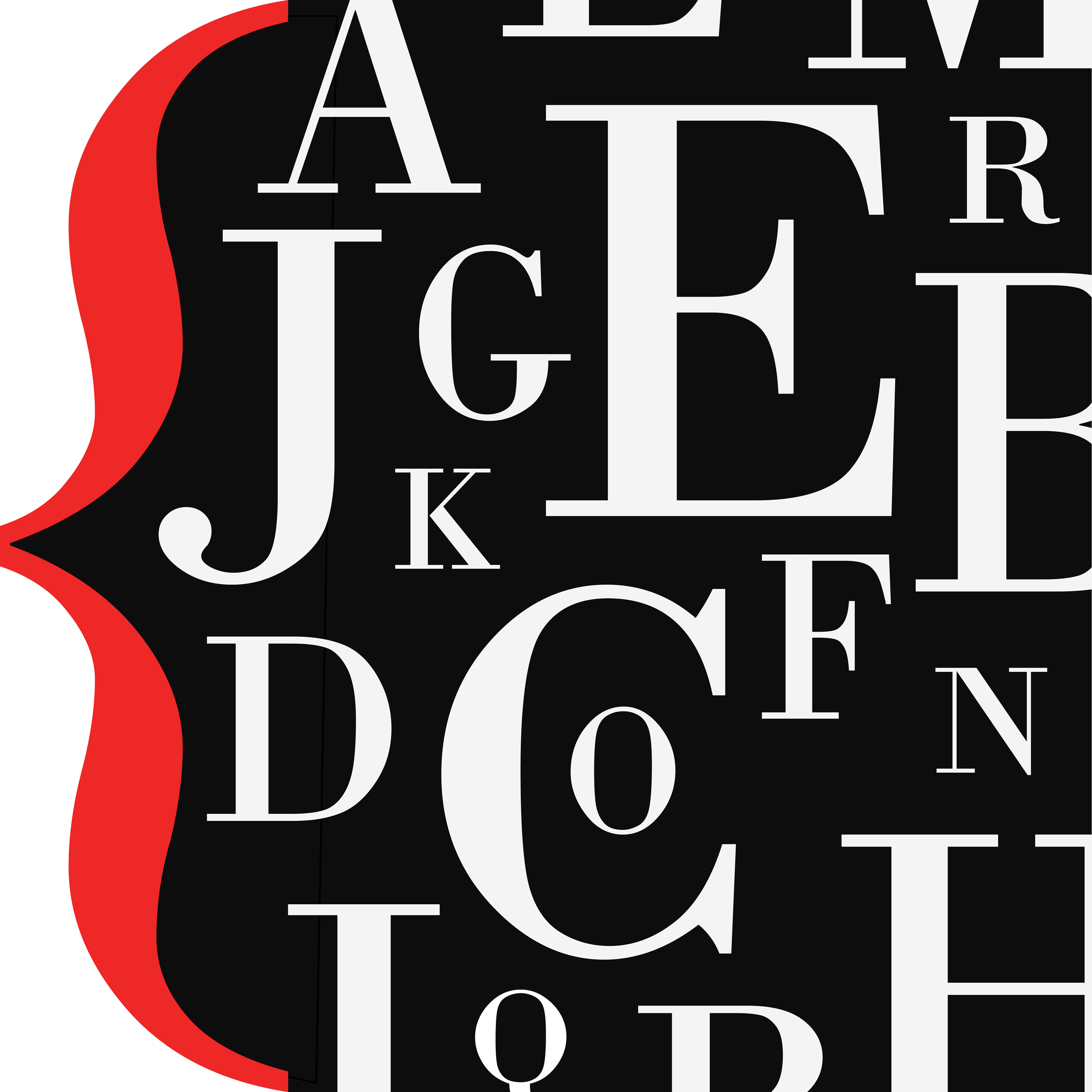
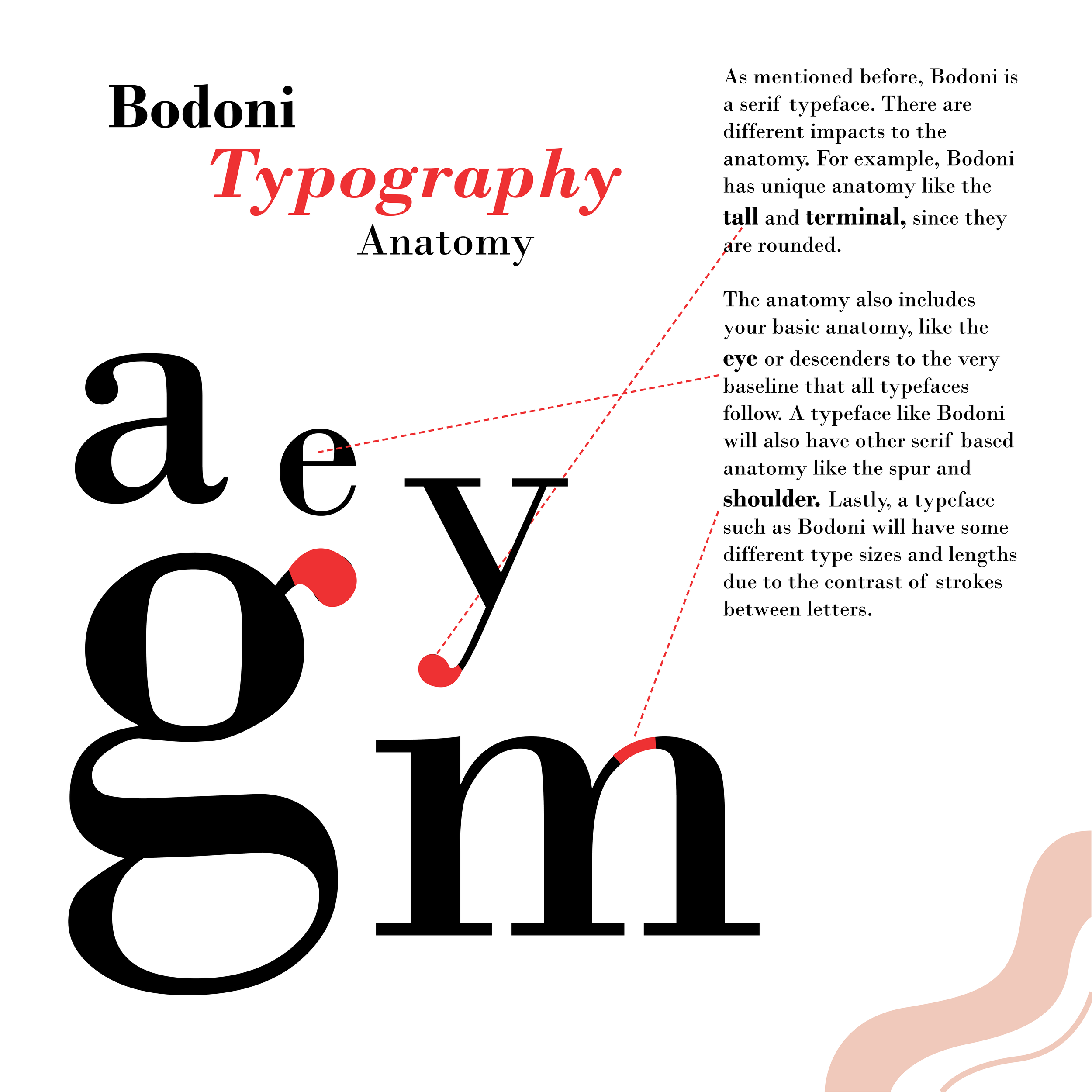
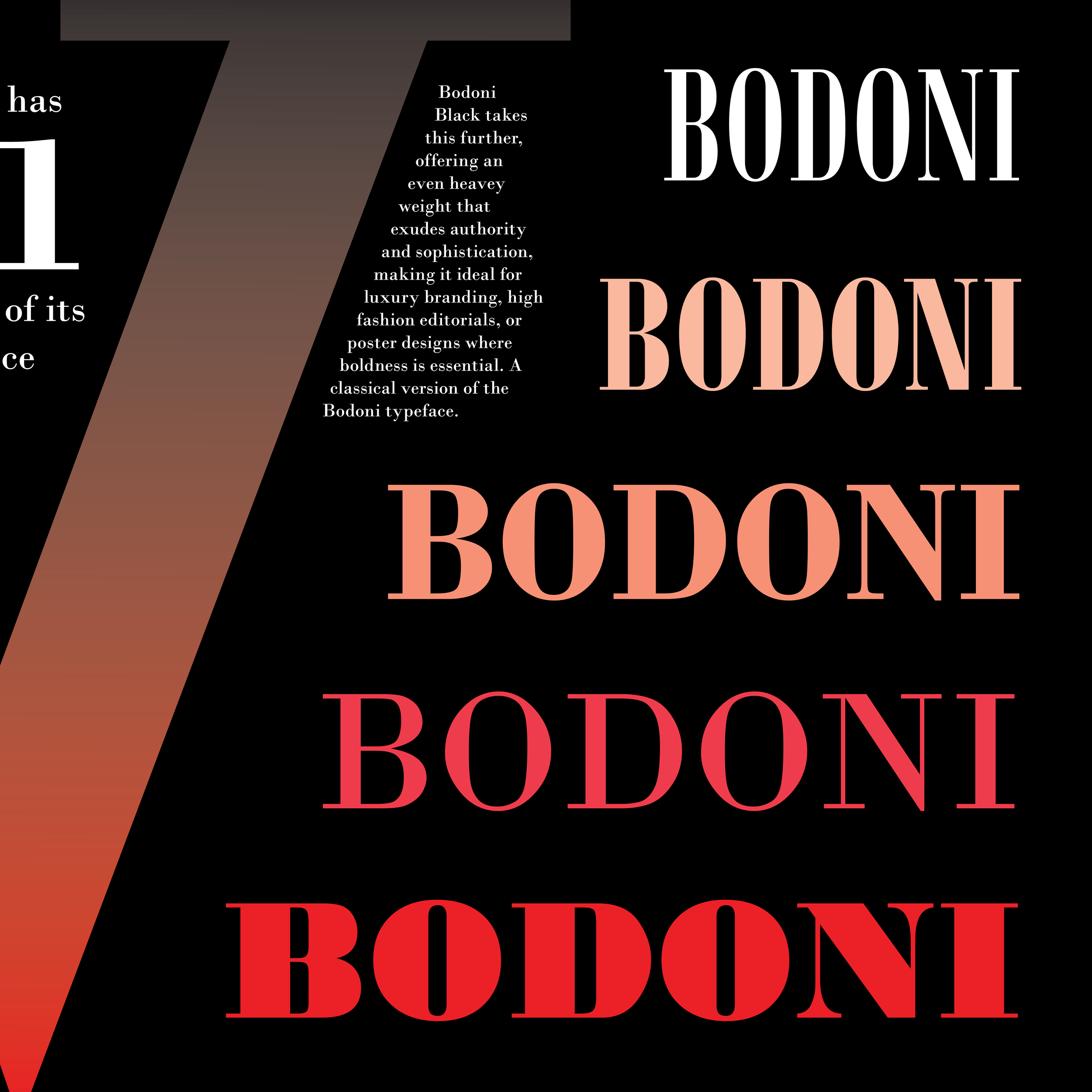
The Bodoni typeface was created in 1798 by Giambattista Bodoni. Following the font Baskerville, Bodoni was meant to be contrasting font, with a mix of the thick and thin lines. Bodoni is considered one of the first Didone fonts or “modern” typefaces, meaning its known for its geometrical shaping. Plus as a modern font, it is known for its ability to make captivating headings and titles, like in brands like Calvin Klein and Gucci.
I chose this font specifically because of its unique structure and its striking visuals. Its a very popular font, and used in many books. I wanted to make a shift from fancy or high quality branding to put more emphasis on its contrast and style.


Inspiration
I looked at so many different typefaces books trying to find inspiration. However, the ones that I felt inspired by the most were ones that pushed typography to play with perspective. Having letters be a part of the image and create visual contrast between the smaller, heavy text was wicked cool to me. And I wanted to be able to accomplish similar goals.
I was also a huge fan of how the designers utilized color within their pieces. For example, the Garamond one has these cooler yellows and greys while Bodoni has a lot of blacks and whites mixed, resulting in heavy contrast. They were able to match and stylize the fonts perfectly with the color and found that really interesting.
Process: Sketches

Above are some of the sketches I created. I wanted to create a variety of different ideas of styles and themes to focus on.
Process: 3 Versions


Bodoni Book Version 2
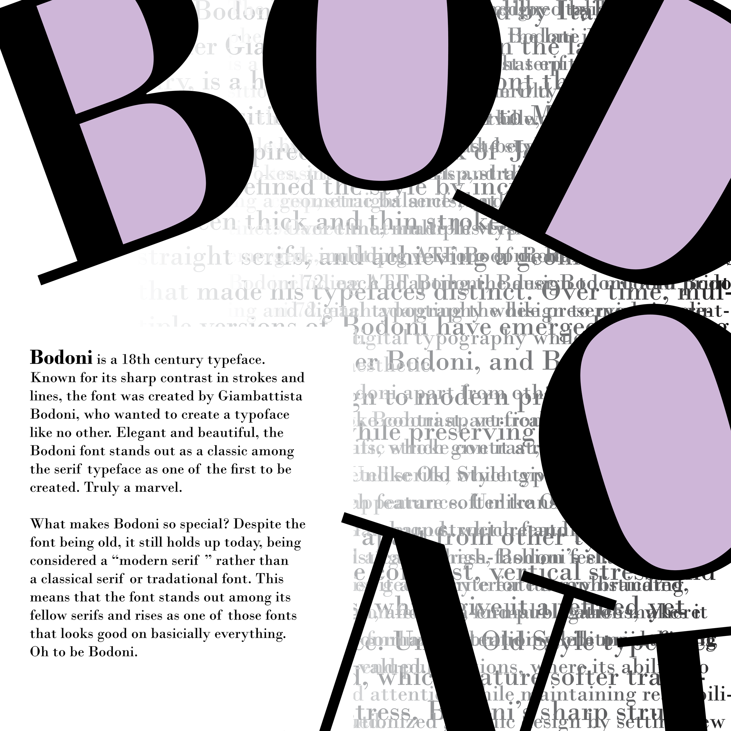
Now this was an upgrade. While I liked my simple design, I think this was a better upgrade. I really wanted to play the typography in different ways, literally. I wanted to make to make an animal out of the type. Using Bodoni’s sharp contrast, I created a butterfly out of the type. And using a lovely lavender color, it created this sharp yet soft look of Bodoni.
I really liked this version too. However, unlike the first one, this one was pretty successful. But it was still missing something. Like everything fit well, but not perfectly. So with the second verison done, I begin the final verison.
Bodoni Book Version 1
For the first version of the book, I wanted to try a simplistic look with shades of green. Green especially was not used a lot in Bodoni styled books so it felt like a nice change of pace. I wanted to emphasis the style of the font first and foremost. Keeping the visuals limited.
While I did like this first attempt, this won’t convince me to be interested in Bodoni as a typeface I’d use. It feels just too simple, like as a serif, there isn’t enough. Plus I see why green isn’t used with Bodoni. It just doesn’t fit the vibe. But still, a good attempt nonetheless.


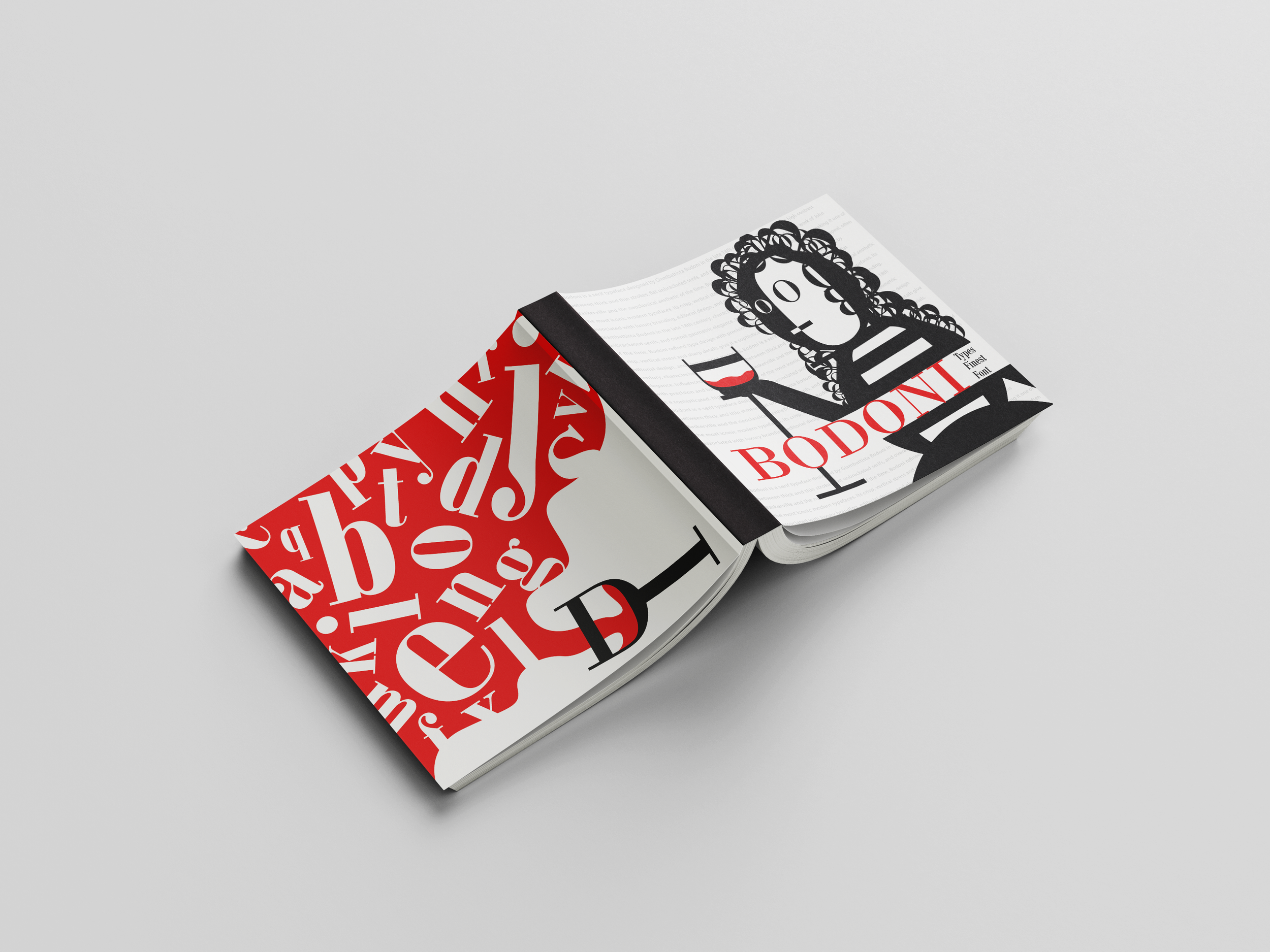
Final Version
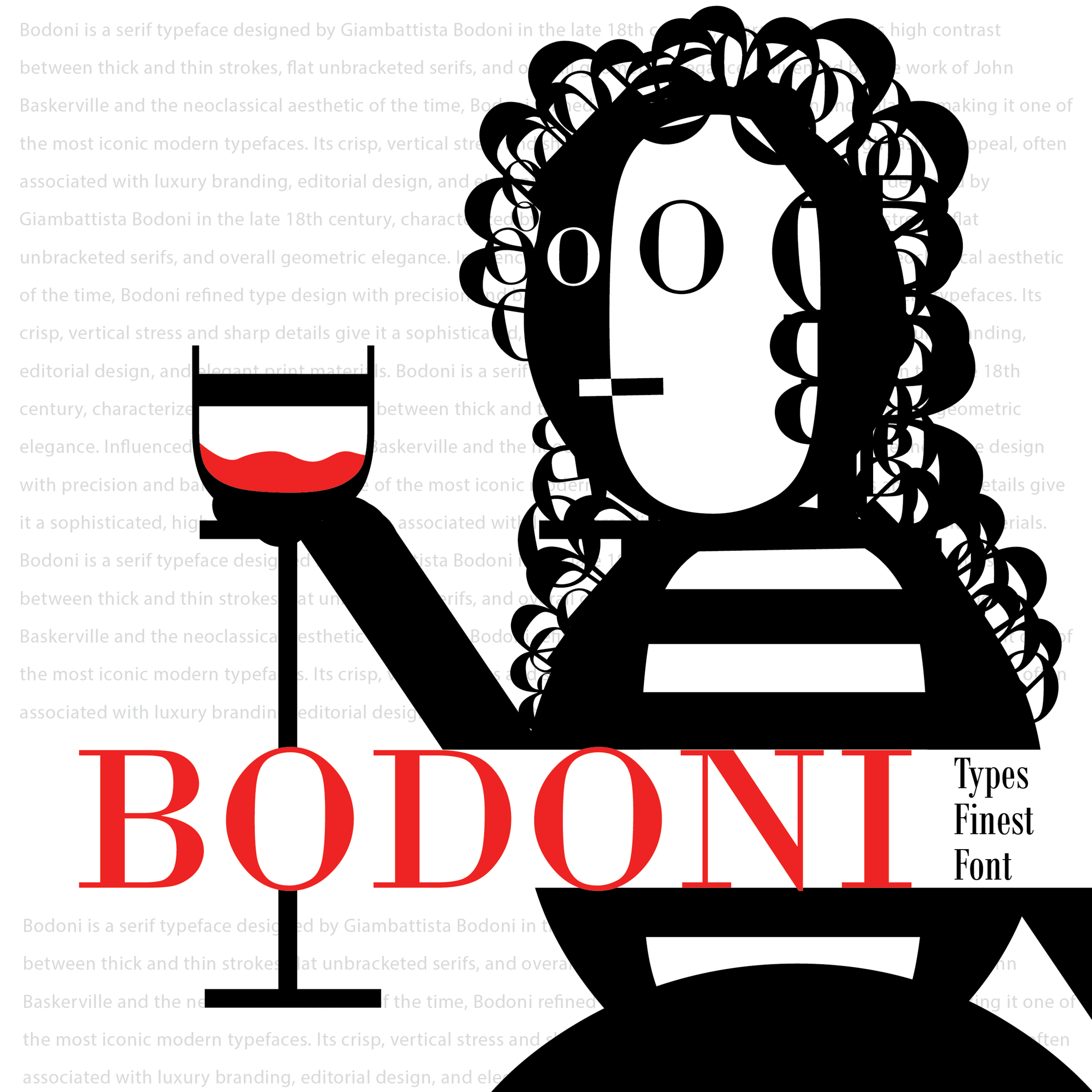
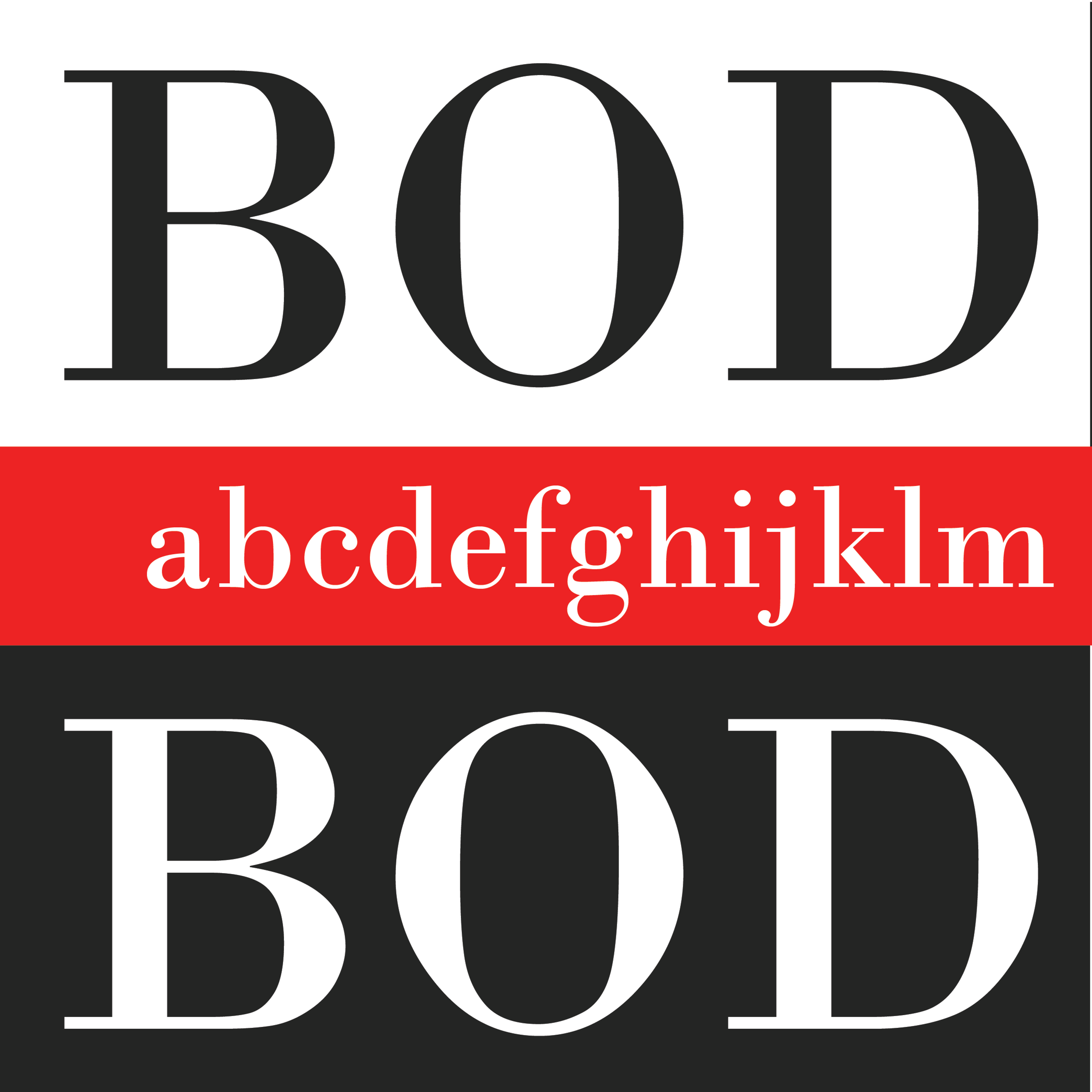
I never expected the best version to be as good as it turned out. Using a red color palette, I was able to create a striking display of content. Everything felt perfect. The pages showed both Bodoni’s function as a typeface well, as well as a creative font that can be used in many different ways. Using my old idea, I created the cover only out of the word “Bodoni” and made into a woman with wine, showing its normal fancy nature but also its gorgeous contrast of fonts and styles.


Review
After everything was done and finished, I made a few different mockups of what the pages would look like as a book. And honestly? I think it turned out so well. I learned so much from this project as well like:
How Bodoni is works as a typeface in general.
The thought behind what the font stand out. Bodoni manages that perfect mix of sharp and geometrical
How much work is put into a single typeface and its uses. This entire project only used 1 font and a single color palette. That is extremely hard to do.
But I’m happy with how this turned out. And Bodoni, what a masterclass of a typeface you truly are.